Creating warmth and growth in difficult subjects.
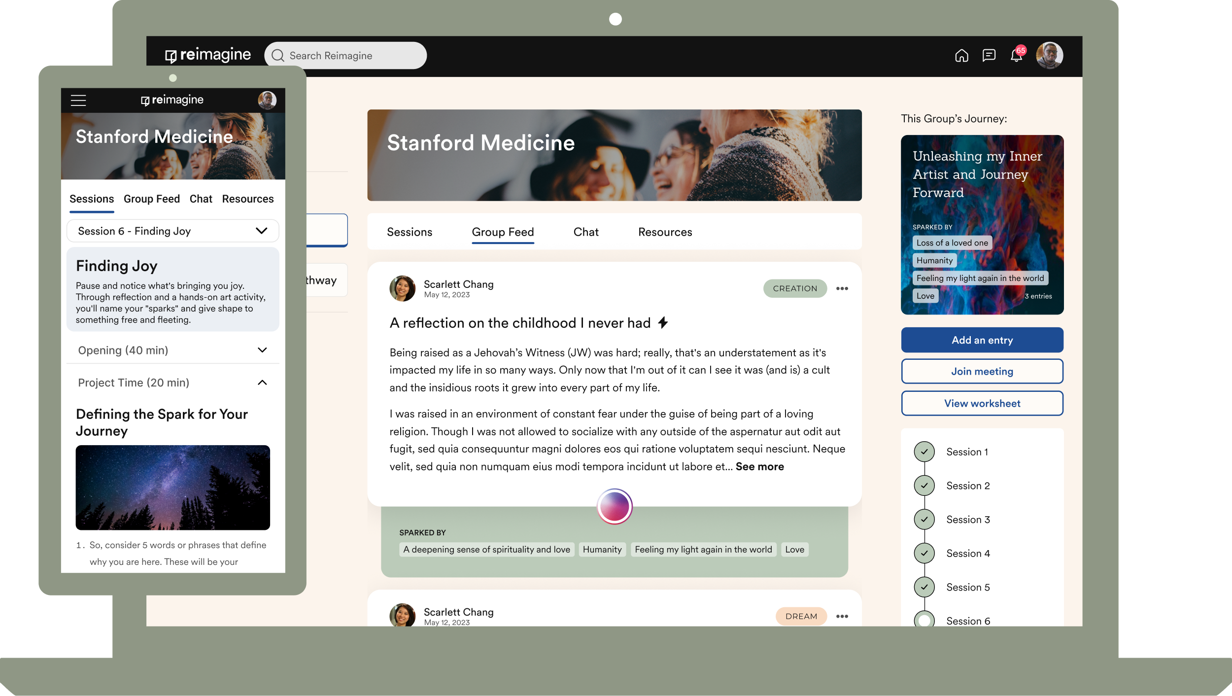
Reimagine is a non-profit social platform that helps people move through grief and life's hardest transitions through guided programs and community. I designed a reflective social feed, a "holding space" micro-interaction, and course pathways. Soft color, gentle structure, and small moments of warmth.
Four Ways to Show Up
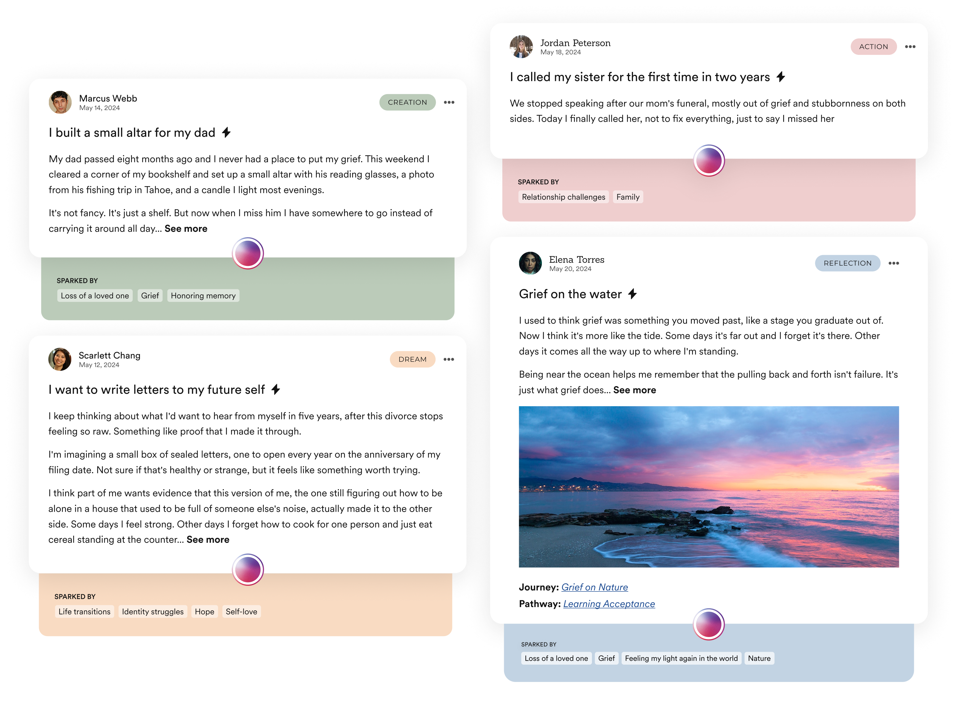
The social media platform has a unique take on posts. Every post falls into one of four types: Creation, Dream, Action, or Reflection, each with its own color and tone.

Holding Space
Instead of liking a post, members press and hold the button for as long as they want - a small, quiet gesture of support that feels more honest and deliberate than a tap.
Course Pathways
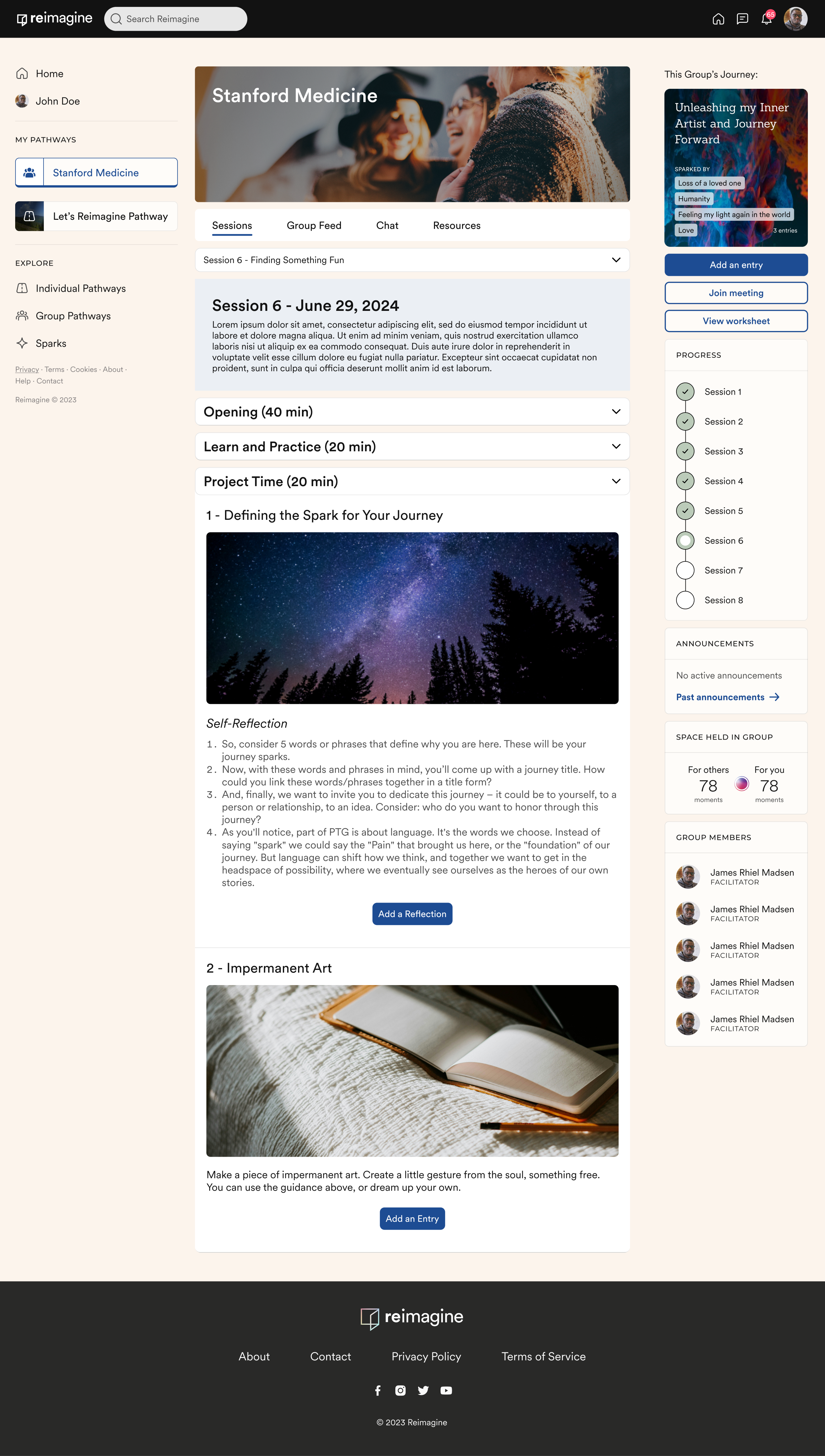
I designed the session structure that guides each group through a multi-week healing pathway. Every session breaks into digestible blocks like Opening, Learn and Practice, and Project Time, with grounding exercises, guided visualizations, and reflection prompts woven in. A progress tracker keeps people oriented, and a quiet "space held in group" metric reflects collective participation without turning healing into a competition.
Chat rooms for connection

A dedicated space within each group for real-time conversation, separate from sessions but part of the same shared journey. Less quick-messaging, more about staying connected between sessions.
The thread blends real conversation with quiet signals of the group's progress, so checking in on chat also means seeing momentum. It keeps people feeling part of something ongoing, not just present for scheduled meetings.
Users can click links to view special posts their group members created.
Responsive Design
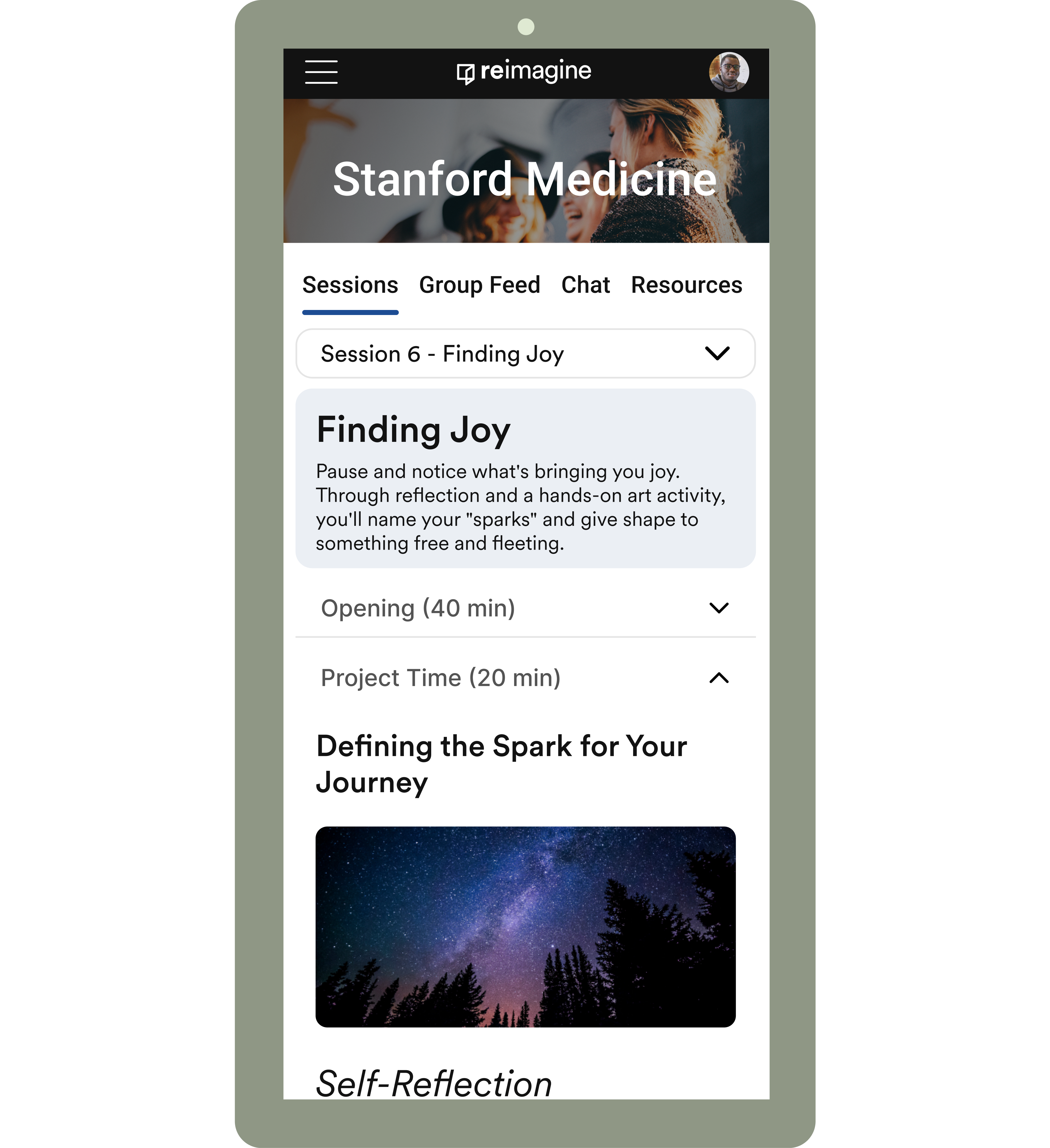
Mobile responsive design lets users engage with sessions, reflection prompts, and community whenever they have a moment. During commutes, between meetings, or late at night. Every feature scales across screen sizes without losing the depth and intention that makes the experience meaningful.
Reimagine taught me how to design for people at their most vulnerable without losing warmth or trust. Every detail, from soft color to the language around sharing, was in service of one goal: making hard things feel a little less harder.